How to Select the Best Sans Serif Fonts for Modern Design
Sans serif fonts have become the backbone of modern typography due to their clean lines, versatility, and readability. From websites and mobile apps to branding and print media, these fonts adapt seamlessly to almost any project. TypeType foundry offers a diverse range of sans serif fonts that combine aesthetic appeal with functionality. Understanding the different types of sans serif fonts and how to apply them effectively can elevate your design work and make your projects visually engaging.
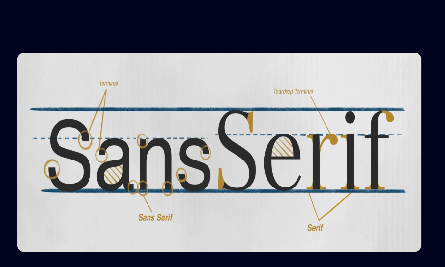
Characteristics of Sans Serif Fonts
Sans serif fonts are defined by their lack of serifs, giving them a minimalist, modern appearance. They are typically easy to read at both large and small sizes, making them ideal for a wide variety of applications. Fonts like TT Norms® Pro and TT Commons™ Pro from TypeType foundry exhibit a perfect balance between neutral design and strong visual identity. Their geometric shapes, clean lines, and multiple weights provide flexibility for headings, body text, and user interface elements, making them versatile tools for designers.
See also: Essential Dos and Don’ts for Installing Draper Projector Screens Flawlessly
Popular Sans Serif Fonts from TypeType Foundry
TypeType foundry’s collection of sans serif fonts is extensive and well-regarded in professional design communities. TT Norms® Pro is a geometric sans serif font, perfect as a “workhorse” for websites, print, and branding. TT Commons™ Pro is a modernized classic, offering a clean and functional design suitable for almost any context. Other popular choices include TT Hoves Pro, TT Firs Neue, and TT Fors, each offering unique features and multiple styles for comprehensive design flexibility. Humanist sans serifs like TT Wellingtons and TT Corals bring a calligraphic touch and natural stroke variations, enhancing character and readability.
Pairing Sans Serif Fonts Effectively
Pairing sans serif fonts strategically can create visually appealing typography hierarchies. Combining a bold sans serif headline like TT Norms® Pro with a subtler body text font such as TT Hoves Pro creates contrast while maintaining cohesion. Designers often mix geometric and humanist sans serifs to balance structure and warmth, ensuring text is readable and engaging. Exploring different weights and styles within the same font family can also establish hierarchy, emphasizing important information without cluttering the design.
Best Practices for Using Sans Serif Fonts
When implementing sans serif fonts in design, context and medium are critical. For web and app interfaces, fonts with clear spacing and legibility, such as TT Commons™ Pro, ensure a comfortable reading experience across devices. For print, bold styles like TT Firs Neue make headlines striking and memorable. Designers should also pay attention to kerning, line height, and contrast to maintain clarity. Using variable fonts like TT Norms® Pro allows flexible weight adjustments, making your layout dynamic and adaptable for diverse applications.
Conclusion
Sans serif fonts from TypeType foundry offer unmatched versatility, clarity, and modern appeal. Fonts such as TT Norms® Pro, TT Commons™ Pro, and TT Hoves Pro provide designers with reliable and stylish options for web, print, and branding projects. By understanding the characteristics of different sans serif styles, pairing them thoughtfully, and following typographic best practices, designers can achieve polished, professional, and visually compelling results. Choosing the right sans serif font ensures both readability and aesthetic harmony, making it an essential tool in contemporary design.